CASE STUDY
How I initiated gamification design for the personal financial management experience that improved user engagement and product adoption
January-March 2024
After launching the “interactive deck” in March 2024, the monthly session per user went up by 12% and new users' adoption of the Connect feature increased by 3%. It was a journey of connecting the dots and weaving existing technical capabilities together.
Collaborating closely with a product manager, I led the agile team of one designer, two developers, and a data analyst. I was responsible for shaping the overall design direction of this project. I encouraged early ideation and collaboration with the rest of the team throughout the project.
Situation
Rocker provides different financial products including private loans, debit cards, and open banking.
Whilst we provided the analytical insights to help people improve their financial status, sometimes the result could have been more accurate due to the flaw in our source data. In those cases, the users couldn’t resonate with the insights and thus reported them as wrong and unhelpful.
I took the initiative and led the project to identify problems and possibilities, explore solutions and validate them.
Finding the right problem
Learning from surveys and interviews
To explore the problems, I referred to the results of UX research including surveys and interviews.
Based on the survey’s outcome, “wrong categorisation” was the issue reported most by the users, which affected the summary and their economic health score.
Moreover, two interviewees stated that they seldom checked the insights because they thought those were incorrect. One interviewee, who was an active card user, said they didn’t see the value of insights - “I know there are numbers about my spending, but what does it mean to me?”

Pivotal meeting to understand business
I had a pivotal meeting with our product manager to gain a deeper understanding of our business goals.
One of the issues he pointed out was “We got open banking data from our partners, what other insights or values can we provide with those?"
After synthesising insights from user research and business views, I coined the problem we wanted to tackle:
How might we provide more value to the customer and enhance user engagement?
Finding the right solution
Workshop - "working together, alone"
To foster creativity, I run a remote design studio workshop with a fellow design colleague to work together, alone.
After reviewing the insights and problem statement together, we set off for individual brainstorming to generate concepts and sketches. Then we took a break, presented ideas, gave feedback to each other, and reviewed previous concepts. In our second sketching session, we made new sketches and improved by naturally converging and improving ideas.
At the end of the workshop, we grouped 12 concepts under 7 themes and voted 2 of them based on three criteria: value for the user, technical feasibility, and potential impact on other features or business.

Presentation to stakeholders
I organised our ideas and presented them to the management group, walked them through our thought process, showed all the sketches we made and mentioned what we believed should be prioritised.
The management team appreciated the “re-categorise game” concept which turned the mundane task into a gamified experience, as well as its potential to navigate customers to other features. Thus we continued to explore this concept further.

Exploring possibilities
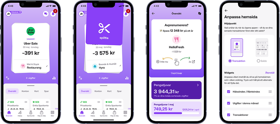
The original idea was merely for users to review the category of each transaction. When they are satisfied, they can swipe left or right and move to the next one.
We brought the following questions with us when proceeding with idea generation:
-
Can it be enriched by enabling more actions?
-
Can swiping directions lead to different results?
-
What do different transactions mean to the user?
At this time, the concept of “money thief” arose. It stemmed from the interview insight that users regard some transactions as unnecessary and thus reflect on how much they could save by cutting those spending.
Among our ideas, we proposed merchant tracking and setting spending goals to support building awareness around potential “unnecessary spending”.

Prototype testing guided design decisions
To support continuous improvements, I adopted the Lean UX approach to prototype, test, and iterate quickly. Prototypes were built to provide tangible feelings for testing, where we gathered feedback and improved accordingly.
From the tests, I noticed that:
-
the large amount of information and options on the screen were overwhelming at first sight.
-
the existence of buttons was invaluable - they not only provided visual cues about the features for new users but also improved the accessibility of the functions.
Therefore, the following decisions were made:
-
Limited to 3 actions
-
Showed buttons on the screen; placed at the bottom for better accessibility
-
Moved category options to the sub-flow to remove clutter

Moving the sub-flow
We had different solutions for splitting transaction(s) - may it interrupt the reviewing and swiping or shall it happen after reviewing the transactions?
We went for the "interrupt" flow because:
-
It is an action of managing the transaction that the user wants to perform and finish immediately. When the transactions to split were presented afterwards, the user might lose context because they have gone through other transactions.
-
The existing split flow in the app is simple and short, except if the user wants to create a new group. Thus handling it wouldn’t affect the flow of reviewing and swiping.


Test, validate, iterate
We conducted guerrilla testing to validate the solution. By observing and interviewing, we learned how they used it and whether this concept made sense to them.
“I rarely review my transactions but with these cards, I’d like to go through them.” (comment from a user)
It was fascinating to see users looking back on their purchases and reflecting on them. The tests also guided towards improvements in visual and interaction design.
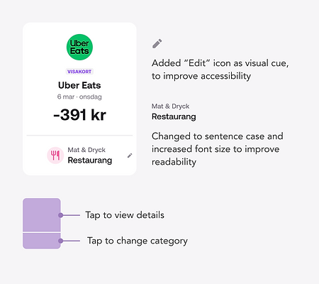
Improved visual and interaction of transaction cards
While observing one user swiping through transactions, I noticed they paused and tried to recall what the expense was for. They wanted to see more detail about the transaction so they tapped on the transaction card, expecting to land on the transaction detail screen, even though they had just tapped to re-categorise a few seconds ago.
Another user appreciated the quick access to change categories because they reviewed and edited the category for each transaction meticulously. But they felt that they accidentally discovered this feature because it was not obvious enough on the card. They also commented that they found the labels slightly small to read.
Improvements made:
-
Added visual cues to improve accessibility
-
Improved the typography for better readability
-
Divided the card into two areas: the upper part navigates to the transaction detail page and the lower part for editing the category.
Improved drawer interaction
We noticed that some participants found it difficult to drag and expand the drawer. To make the contents more accessible and ensure smooth interaction, we implemented 'tapping to switch tab' and 'scrolling' as additional triggers to expand the drawer.

Personalisation and customisation
Having our diverse user groups in mind, I want to cater for their different needs and help them achieve their goals faster.
We were focused on the open banking feature and prioritising it on the home screen for all our new users.
However, the interviews and feature adoption data showed that the loan and payment service customers coming from our and partners' websites were less interested in connecting their bank and managing their finances in our app.
Therefore, I took the chance to modify the contents on the home screen, making sure that we presented the most relevant and personalised information for the user.

Furthermore, the customisation of drawer position was a significant step in giving users control to shape their unique experience.
Depending on what was most important for them, whether it was to stay on top of their expenses or check their card balances, the user can set the default position of the drawer.

Results
Since the goal was to enhance user engagement and provide more value to the user from open banking data, we reviewed engagement metrics and the adoption of the Connect feature after launching.
12%
increase of monthly session per user
3%
increase of new users' adoption of Connect
Learnings & next steps
Short-term memory is limited in both capacity and duration. By observing the users I noticed that they forgot what they had performed, taking the same action but expecting different results. It indicated the room for improvement and underscored the importance of visual cues.
Reviewing expenses is a mundane task, but it is the first step to building awareness of one's finances and improving it accordingly. By adding gamification to the experience, we wanted to make the experience interesting and thus help users shape the habit. We've ideated and sketched further steps including milestone badges ("Amazing! You've gone through 50 transactions!"), but we didn't have the chance to continue working on the project due to the organisational changes.
It takes time to learn new stuff, and so do the interactions and flows. When we have time, we would love to investigate how people used it after months: Do they need to play around to recall how to re-categorise and sort transactions? Are they more aware of how they spend and what they spend on now?