
Braive
DESCRIPTION
Providing online treatment programs to help you become your own therapist
As an Upbeater, I worked for the client, Braive, who is providing online programs to help people building healthy minds.
I redesigned the website from scratch, worked on both interaction and interface design.
MY ROLE
Interaction Design
Interface/Visual Design
UX Research

Overview
Mission
To improve the client's website, provide a better user experience with the ease of use
Process
1. Define
-
Review the website
-
Heuristics Evaluation
-
Site map
2&3. Design & Prototype
-
Wireframes
-
Interface design
-
Prototypes (low fidelity and high fidelity)
4. Test
-
Usability test
-
2 rounds of iteration
5. Deliver
-
Design document
-
Usability test report
-
Walk-through video
Outline
Team & Collaboration
-
Individual project
-
Work closely with the client:
-
updated progress regularly
-
during meetings, rationalised my design decision and confirmed the feasibility with them
-
Outcome
-
Final design files, design documents, report of usability test, and a walk-through video.
-
Some of the suggestions are already implemented.
Background
Braive wants to improve the user experience of its website, to make sure it is clear about the service and converting visitors to customers.
Thus, this project focused on user experience and interaction design. The interfaces were redesigned based on the existing visual language.
Procedure
-
Define:
-
Heuristic evaluation of the website
-
Site map
-
-
Design & Prototype:
-
Wireframes and low fidelity prototype
-
Interface design
-
High fidelity clickable prototype
-
-
Test:
-
2 rounds of iteration
-
usability test
-
Analysis of the result
-
Revision of the design
-
-
-
Deliver:
-
Final delivery documents
-
Walk-through video
-
Iteration Examples
The usability tests provided useful feedback regarding the design. Here are two examples of the iterations:
1. Above the fold
Original website
Carousel
Automatic carousel is distracting, it interrupts the user's attention
MHC session
Without any description about MHC, users can't get enough info at the first glance

First design
Intro
Point out the service "iCBT program" and use a slogan to state the value
MHC session
use a caption to explain MHC

Usability test result
Two participants noticed the "MHC" first and regarded it as the main service.
They didn't understand what the "iCBT program" meant and therefore skipped it.
Second design
Intro
Rewrite copy for better communication
Use hero image to add visual impact
MHC session
Rewrite the copy for explanation
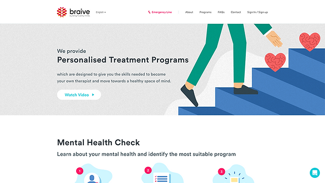
Usability test result
All participants noticed the introduction section first.
2. Programs page
Original website
Inconsistency
Other pages has a intro section at top
Drop-down filer
only contains four items, inefficient
Program Cards
Description area is too small to provide adequate information.
Repetitive information across the page.
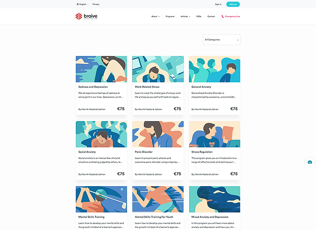
First design
Consistency
Intro section at top, as other pages.
Move repetitive info to this section.
Text buttons
Utilize text buttons as filters
Hint
Utilize text buttons as filters
Program Cards
Add a category tag.
Increase the description area, change the copy to provide more information.

Usability test result
All participants ignored the price information on the programs page and turned to the program detail page to find the pricing information. It indicated the need for having a price tag on the detail page.
Second design
Hint
Emphasize the hint
Program Cards
Remove the category tags.
Place the price tags back.
Usability test result
One participant was strongly opposed to having price tags on the programs page.
Thus, a version of programs page without price tags was made. In the following tests, participants were asked to compare two versions of the programs page.
Final Design
Four pages from the final design:


Learning
During this project, I researched into web design to investigate the trends and learn more details regarding specific elements, as well as information architecture.
Another thing that I learned was about the data privacy (GDPR) when I discussed with the client if we could simplify the MHC process, whether the sign-up should happen before the MHC or not. It is also related to ethical design.
I also learned how to report my progress and convey more effectively during distant working. Moreover, I noticed the importance of aligning with the client: having deep knowledge about their business and situation would save time in the process, both on making design decisions and communications.